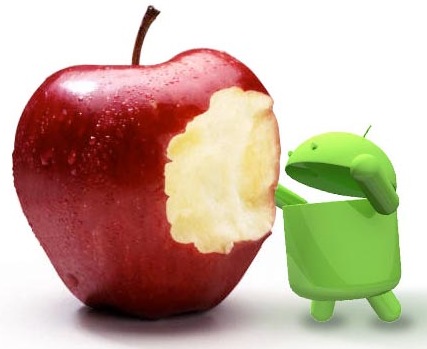
WWDC 2012 saw loads of new features and products announced by Apple. But, there’s still one key feature that Apple hasn’t improved enough to catch up with Android.
While iOS 6 includes Apple’s new 3D Maps app, Facebook integration, an update to Siri, and a revamped mobile iTunes store, the platform still has one big weak spot: Alerts
It’s hard to argue that Android is more usable than iOS overall. The truth is that iOS is a more limited, simplified experience, but that makes it easy for most users to pick up and start using right away and makes it hard for them to get themselves in trouble by misconfiguring things. By contrast, Android is more flexible and customizable, but it can also be more difficult to navigate and more apt to confuse smartphone novices.
However, the alerts system is the one area where Android is just flat out more useful and more usable than iPhone. If that sounds trivial, it’s not — especially for business professionals and others who do a lot of stuff with their smartphones. Alerts give you timely updates of important information, quickly let you know about things that need your attention, and give you an at-a-glance look at your latest messages from various sources.
The biggest advantage that Android alerts have over iOS alerts is immediate glance-ability, and a lot of that has to do with the fundamental design of the platform. That’s why iOS appears unlikely to catch up in this area any time soon.
When you turn on the display on your Android phone you see a bunch of little badges in the top left corner of the screen that let you know you’ve got new messages or that a calendar appointment is about to happen or someone is talking about you on social media or there’s a severe weather alert in your area.

Android alerts provide an immediate glance at the stuff you care about.
In iOS, you actually have to swipe down from the top of the screen to open the Notification Center and then scroll through your whole alerts list by app to see what all you might need to address. A lot of iOS users just aren’t in the habit of checking the Notification Center since it’s a newer addition to the platform.

The iOS 5 Notification Center has handy weather and stock updates but alerts require a lot of scrolling.
More often than not, the habit in iOS is to see if your apps for Mail, Messages, Calendar, or Twitter (or various other apps) have their red alert badges in the upper left corner activated with the number of important new things you haven’t seen yet. Then you go straight into each app and check the new stuff. Lots of iOS apps can use the red alert badge now and it’s handy for the stuff you want to track most often, but it’s obviously not as efficient as that quick glance in Android.

A single alert in iOS can quickly get your attention, but it can break down when you have multiple alerts.
Once you get past the glance-ability, Android also has iOS beat when you dive into the listing of alerts. Ironically, iOS is actually more configurable and customizable in its listings, but Android’s default configuration nails it, and that’s more important since most people never change the defaults. While iOS lets you decide how many alerts you want to show for each app and how you want to organize them, Android simply mixes up the alerts and shows them in chronological order from the time they happened. In Android 4.0, you can also simply swipe right to dismiss individual alerts, which isn’t possible in iOS.

Here’s a comparison of the alerts listings in iOS and Android.
Surely iOS beats Android in numerous areas too, but Alerts is one area where they have to do a great deal of change so as to achieve what Android has achieved.
Credit: Jason Hiner, CNET


