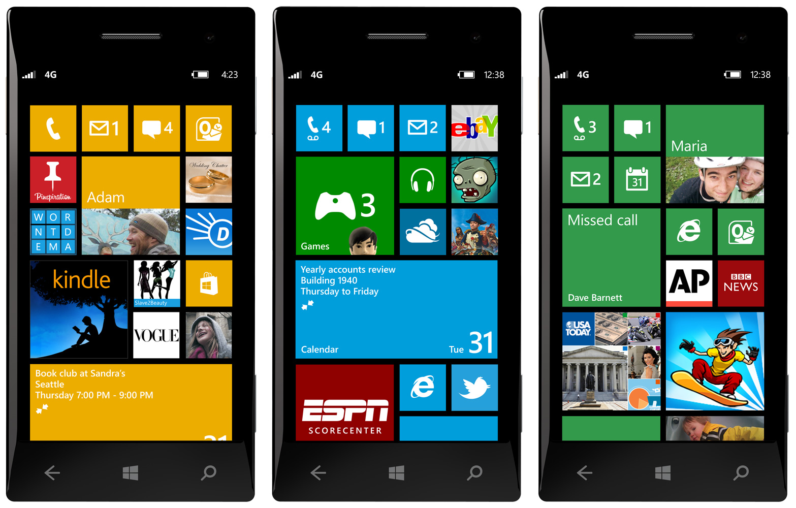
Personally, I fell in love with the Windows Phone 7, they first time I held it in my hand and saw the start screen. I loved the neatly organized square tiles that clearly show information in real time—from emails to photos to weather to travel progress—without having to click on applications. The only problem was that of low information density as the tiles took up a lot of space. With Windows Phone 8, Microsoft has solved the problem. And that too without destroying Metro’s simplicity and elegance.
As WP8 chief Joe Belfiore said on stage today, this is going to be the feature that users will love the most.
The new Windows Phone 8 Start screen allows for the same level of customization as the tablet and desktop versions of Windows 8. It lets you move tiles around in any way you want and resize the tiles to small, medium and large sizes:
• The medium size is the square one that Windows Phone 7 has now.
• The small size is one quarter of that size.
• The large size takes over two of the square tiles.
The tiles’ content is highly customizable too. Apart from specific apps’ live tiles, the system would allow you to create specific contact or group tiles, with all the relevant information—emails, Facebook updates, photo uploads, etc.—displayed in real time within the tile.
It will also let you add as many apps as you want to the home screen as icons. By keeping these at the small size, you can create a grid of app icons as dense as the one in the iPhone. Except that here you can also combine those with larger live tiles. Simple, elegant, fully customizable.
The new sizes are also compatible with current Windows Phone 7 apps’ live tiles, so no change on the part of the developer is needed—and you won’t need to re-download all the apps you already have.
Microsoft is also adding more live tile color options, and now you can assign individual colors to tiles; something that users tired of a uniform block of blocks were demanding.
The best part is still to come. The information density issue can be solved now because the tiles are now resizable. Much better and more elegant than the static grid of badge-peppered tiny icons of iOS. Or the painful and ugly cluster of widgets that you can see in most user-customized Android screens.
Resizable tiles give users the ability to increase information density to the maximum allowed on a phone screen while keeping it clean, comprehensive, and pretty. The start screen will provide with as much data as users want, no matter if they are beginners who like just a few important tiles or advanced users who want an information overload.
Microsoft says that this new start screen can tailor each phone to fit each user’s lifestyle. People whose lives revolve around sports would be able to create a screen in which their favorite teams and athletes’ Twitter accounts or Facebook pages are combined with real-time scoring apps, all alongside their own live tiles for mail, weather or games. Those who love social networks would be able to have their favorite friends always on screen. And so on.
Have a look at this video:
[youtube id=”AiGCYLBF_Tw” width=”600″ height=”340″ position=”left”]


